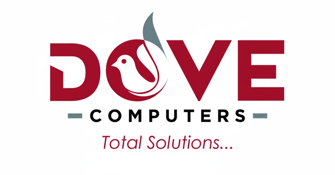
Dove Computers has been a trusted name in computer retail and IT services across Nairobi for years. However, the original logo no longer reflected the company’s evolution into a full-service technology partner. Creativ Razor was tasked with redefining the brand mark to capture this evolved positioning — modern, knowledgeable, and dependable.
The Brief
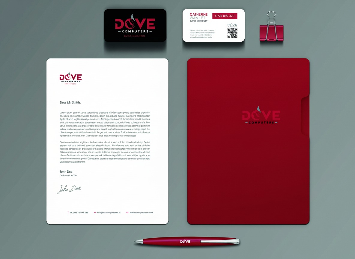
Dove Computers needed a logo that would feel at home in both digital and physical retail environments. The redesign had to maintain brand recognition among loyal customers while projecting a more refined and contemporary image capable of attracting new business segments and corporate clients.
The best logo redesigns feel inevitable — as though the brand was always meant to look this way.
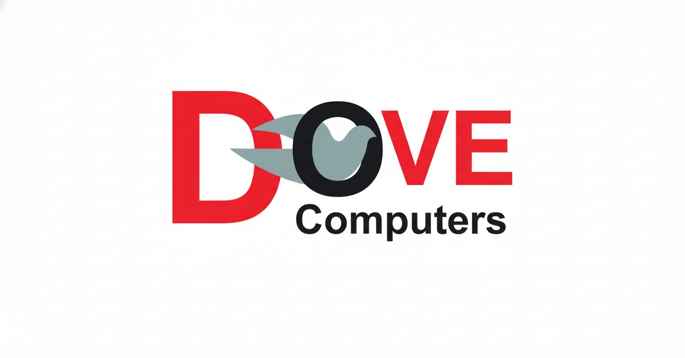
We began by deconstructing the original mark, identifying the core elements that carried the most recognition equity with existing customers. The dove motif was retained and refined, simplified into a cleaner geometric form that communicates precision and clarity — values central to the technology sector.
Key Deliverables
Logo redesign and brand mark
Brand colour and typography update
Storefront signage design
Digital brand assets package
Our Approach
Extensive testing in actual retail environments guided our decisions on colour, proportion, and placement. The final logo was optimized for the challenging constraints of storefront signage, business cards, and the tiny favicon requirements of modern digital presence.
The Result
The refreshed logo gave Dove Computers a significantly stronger presence in competitive retail locations, with the storefront upgrade drawing immediate positive feedback from both existing customers and new walk-in traffic. The brand now presents a unified, professional image across all channels.
Date:March 2, 2026
Client:DOVE COMPUTERS
Services:Re-brand the old logo to a new and more redefined look