Brand Development · 2026
Green Empire - Brand Development
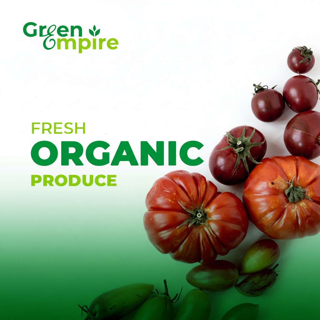
Green Empire is an emerging farm produce company committed to bringing fresh, sustainably grown products directly to urban markets across Kenya. The brand needed an icon that would powerfully communicate their core values — natural quality, environmental responsibility, and the uncompromising promise of farm-fresh goodness delivered daily.
The Brief
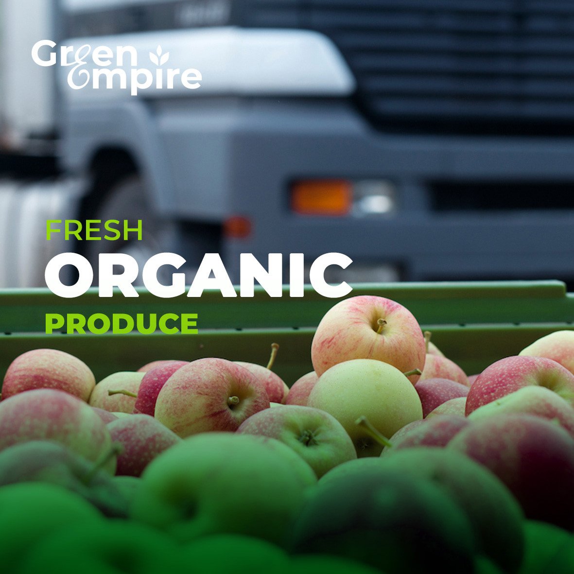
The client required a brand icon that could stand alone as a recognizable symbol across produce packaging, delivery vehicles, and digital platforms. The icon needed to convey freshness and organic quality without relying on overused agricultural clichés, while being simple enough to reproduce clearly at any scale.
Our approach
-
The final icon balances botanical reference with geometric structure, creating a mark that reads simultaneously as a leaf and a crown — symbolizing the nobility of responsible farming.
-
The green colour palette was carefully calibrated to avoid the tired lime-greens of budget produce and the too-corporate dark shades of generic sustainability branding.
The work
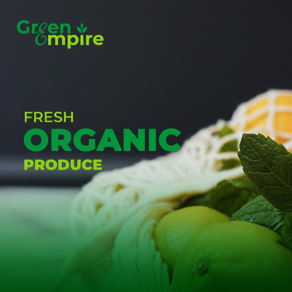
Key deliverables
- Brand icon design
- Icon application guidelines
- Product label templates
- Brand colour specification
Up Next