Caritas Microfinance Bank is a financial institution rooted in community empowerment, providing accessible banking services across Kenya. As the bank expanded its reach into new markets, the need for a comprehensive brand identity system became urgent — one that would communicate both financial strength and community warmth at every touchpoint.
The Brief
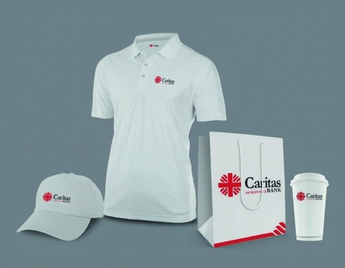
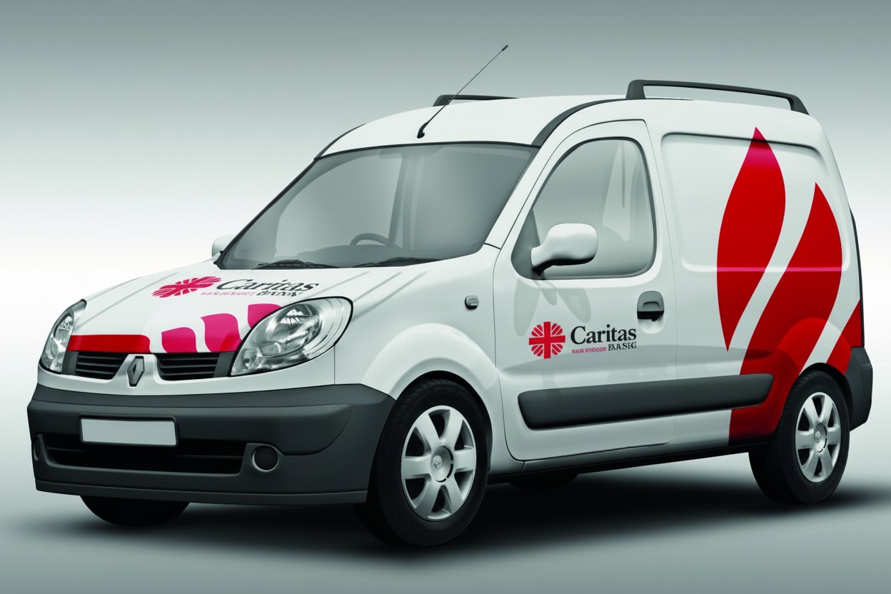
The client needed more than a logo refresh. They required a complete brand ecosystem — from stationery to signage, from digital platforms to physical branch environments. Every touchpoint needed to speak the same visual language of trust, stability, and accessibility to the communities they serve.
A bank’s brand must do two things at once — project unwavering stability while remaining close enough to touch.
We began with a deep audit of Caritas Bank’s existing visual assets and competitive landscape. The research revealed an opportunity to own the intersection of institutional reliability and grassroots community connection — a positioning space that few microfinance brands occupied with genuine conviction.
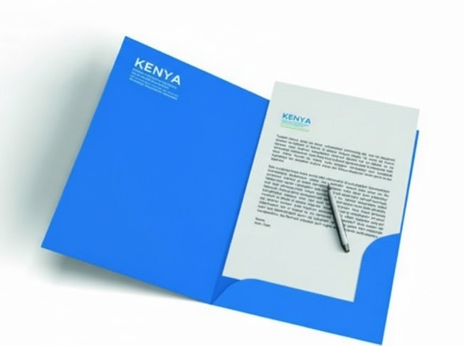
Key Deliverables
Complete brand guidelines document
Logo and identity system
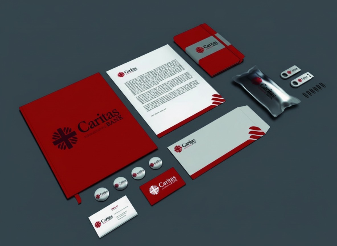
Stationery suite design
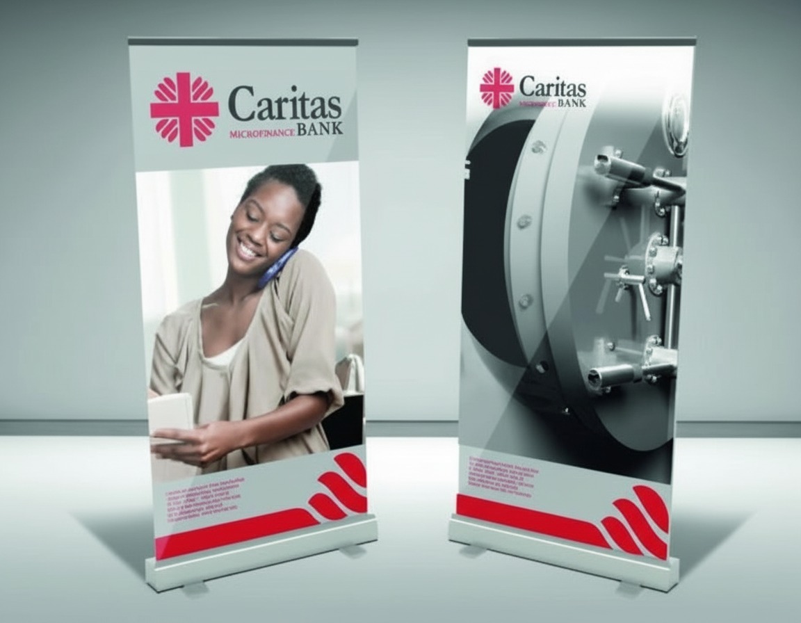
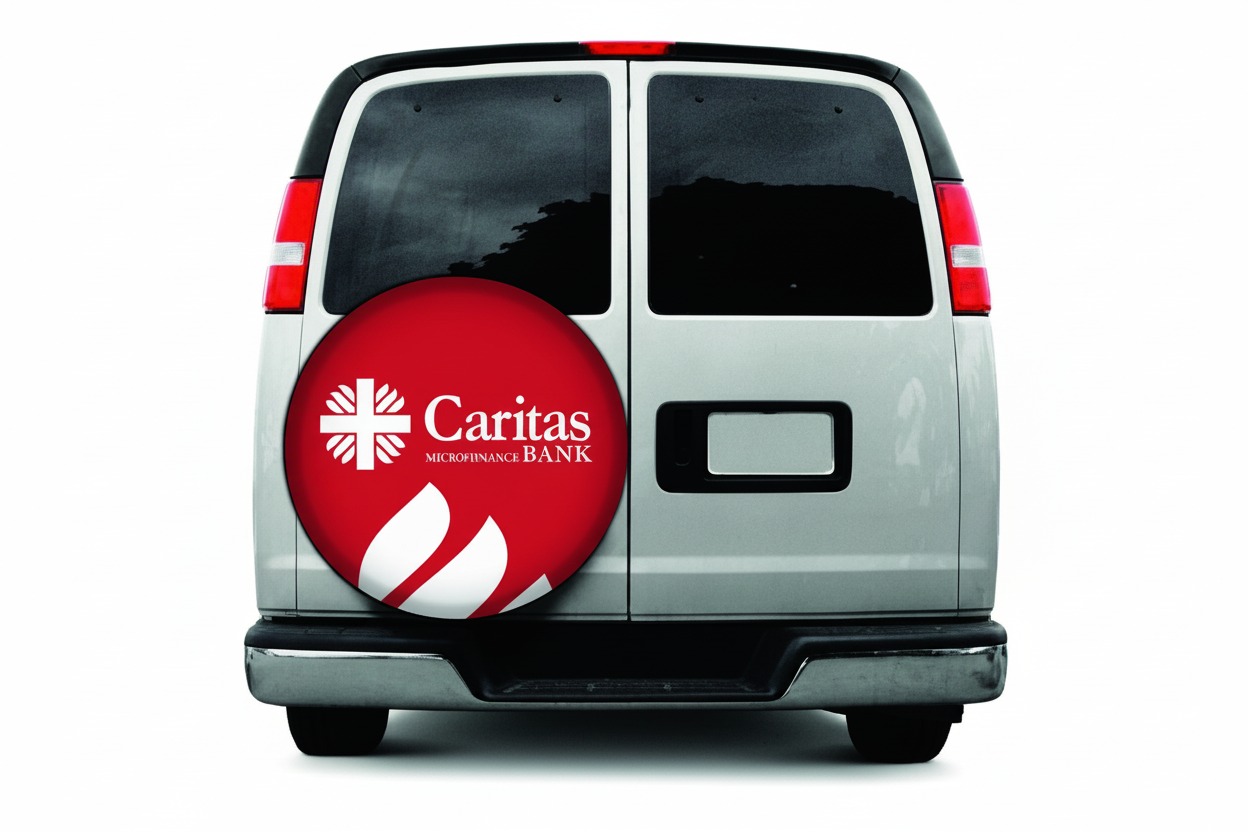
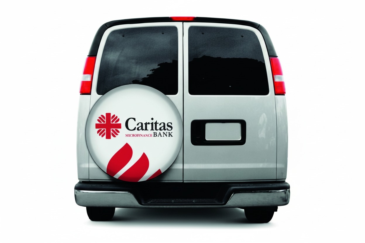
Signage and environmental graphics
Our Approach
The identity system was built on a bold primary mark complemented by a flexible graphic language. We developed a comprehensive colour system, typography hierarchy, and graphic motif library that could seamlessly adapt from the formality of corporate annual reports to the warmth of community outreach materials.
The Result
The new brand identity unified Caritas Bank’s communications across all channels, resulting in measurably stronger brand recognition in their target markets. The detailed brand guide empowered internal teams to create on-brand materials independently, supporting confident expansion into new branch locations.